HAS-QGIS-scripts
Raster Barplot for QGIS
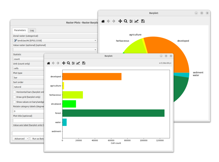
A QGIS Processing script that mimics GRASS’s r.barplot. It draws a barplot or
piechart of a statistic computed for each category of a zonal (categorical)
raster, and renders it in an interactive matplotlib window inside QGIS.
Features
- One bar or pie wedge per category of a zonal raster.
- Statistic per zone: cell count, or the sum, mean, minimum or maximum of an optional value raster.
- For
count, choose a reporting unit: cells, percent of total, or area in m², ha or km² (derived from the zones raster’s pixel size). - Bar or pie plot type; horizontal bars; grid lines; value labels on the bars/wedges.
- Sort bars/wedges by value (ascending or descending), or keep natural order.
- Fill from a single color, the zonal raster’s color table (
-cequivalent), or the active matplotlib style palette; separate border color and width. - Title, axis labels, font size, title font size, font family, and matplotlib
style sheet (e.g.
ggplot). - Interactive matplotlib window with pan, zoom, and save toolbar, or export to PNG / PDF / SVG.
Requirements
- QGIS 3.x with the Processing framework (bundled).
- Python packages:
numpy,matplotlib,gdal,PyQt5— all shipped with standard QGIS installations.
Installation
- Download raster_barplot.py from github
- In QGIS, open the Processing Toolbox (
Ctrl+Alt+T). - Click the Python icon at the top of the toolbox and choose Add Script to Toolbox….
- Select
raster_barplot.py.
The algorithm appears under Scripts → Raster plots → Raster barplot.
To update the script later, edit it in place (right-click → Edit script) or re-add it via the same menu.
Usage
Open the algorithm and set:
- Zonal raster — the categorical raster; one bar/wedge per category.
- Value raster (optional) — required for the sum, mean, minimum and maximum statistics.
- Statistic — count, sum, mean, minimum, maximum.
- Unit — for
countonly: cells, percent, m2, ha, km2. - Plot type — bar or pie.
- Sort order — natural, ascending, descending.
- Flags for horizontal bars, grid, value labels, and label rotation.
- Bar/wedge color — a single fill color, or enable Color bars/wedges from zonal raster color table to use the zones layer’s current QGIS style (paletted or singleband pseudocolor) or its embedded GDAL color table.
- Border color / Border width — outline of the bars/wedges.
- Title, axis labels, font size, title font size, font family, and a matplotlib style sheet.
- Output image (optional) — leave empty for an interactive window, or provide a path to save as PNG, PDF, or SVG.
Notes
- The value raster must share shape (rows × columns) with the zones raster. If not, align them first with Processing → Align rasters.
- Area units (m²/ha/km²) come from the zones raster’s pixel size in its CRS units. For a raster in a geographic CRS (degrees) those areas are not meaningful; a warning is logged. Reproject to a projected CRS first.
- The Unit option applies only to
statistic=count; it is ignored for the other statistics. - A piechart requires non-negative values, and axis labels do not apply to it.
- When zonal colors are enabled but a zone has no color in the layer’s style or color table, that bar/wedge falls back to gray with a warning in the log.
AUTHOR
Paulo van Breugel, HAS green academy, Innovative Biomonitoring research group, Climate-robust Landscapes research group