HAS-QGIS-scripts
Raster Scatterplot for QGIS
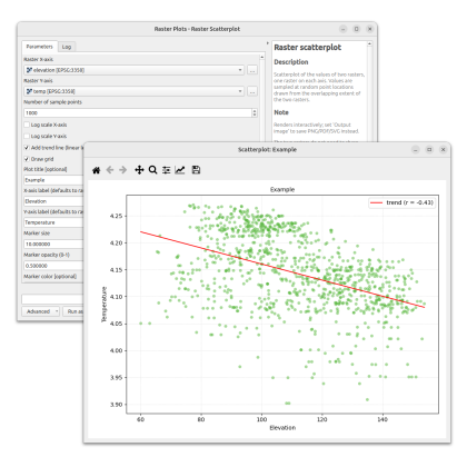
A QGIS Processing script that draws a scatterplot of the values of two rasters — one raster on each axis — and renders it in an interactive matplotlib window inside QGIS.
Values are sampled at random point locations drawn from the overlapping extent of the two rasters, and each raster is sampled at those same locations.
Features
- Scatterplot of two rasters sampled over their overlapping extent.
- Works with rasters of different extents and resolutions (same CRS).
- Adjustable number of random sample points.
- Log scale on either or both axes (non-positive samples are dropped with a warning).
- Optional least-squares trend line and the Pearson correlation coefficient.
- Adjustable marker size, opacity, and color; grid toggle.
- Title, axis labels (default to the raster names), font size, title font size, DPI, and plot dimensions.
- Interactive matplotlib window with pan, zoom, and save toolbar, or export to PNG / PDF / SVG.
Requirements
- QGIS 3.x with the Processing framework (bundled).
- Python packages:
numpy,matplotlib,gdal,PyQt5— all shipped with standard QGIS installations.
Installation
- Download raster_scatterplot.py from Github.
- In QGIS, open the Processing Toolbox (
Ctrl+Alt+T). - Click the Python icon at the top of the toolbox and choose Add Script to Toolbox….
- Select
raster_scatterplot.py.
The algorithm appears under Scripts → Raster plots → Raster scatterplot.
To update the script later, edit it in place (right-click → Edit script) or re-add it via the same menu.
Usage
Open the algorithm and set:
- Raster X-axis / Raster Y-axis — the two rasters to plot against each other.
- Number of sample points — how many random locations to draw in the overlapping extent.
- Flags for log X/Y axes, trend line, and grid.
- Marker size, Marker opacity, Marker color.
- Title, axis labels, font size, title font size.
- Output image (optional) — leave empty for an interactive window, or provide a path to save as PNG, PDF, or SVG.
Notes
- The rasters must be in the same CRS. Extents are compared in raster coordinates with no reprojection; a warning is logged if the two layers report different CRSs.
- Points that fall on nodata in either raster are dropped, so the plotted count is usually a little lower than the requested number of sample points.
- Log axes require strictly positive values; samples with a value ≤ 0 on a log axis are dropped, with a count reported in the log.
- The trend line is fitted in the same (linear or log) space as the axes, so it renders as a straight line on the plot.